< PROJECTS
Overview
BackgroundDesign Process
The Challenge
Research
Design Iteration
Usability Testing
ResponsiveDesign System
Final Solution
Learnings
The Insured Portal digitizes industry-wide insurance practices that are labor intensive with inefficient communication between insurance companies and the insureds.
Timeline
3.5 months
3.5 months
Tools


Process
Heuristics analysis
Prototyping
Responsive design
Design system
User research
Usability testing
Heuristics analysis
Prototyping
Responsive design
Design system
User research
Usability testing
Team
Victoria Liang (UXD)
Alan Fang (UX Lead)
Joe Kimlinger (Dev Lead)
Cameron MacArthur (CEO)
Joshua Saunders (Customer Success)
Victoria Liang (UXD)
Alan Fang (UX Lead)
Joe Kimlinger (Dev Lead)
Cameron MacArthur (CEO)
Joshua Saunders (Customer Success)
Role
Product designer
Product designer
Tools


Skills
Heuristics analysis
Prototyping
Responsive design
Design system
User research
Usability testing
Heuristics analysis
Prototyping
Responsive design
Design system
User research
Usability testing
Team
Victoria Liang (UXD)
Alan Fang (UXD)
Joe Kimlinger (Dev Lead)
Joshua Saunders
(Customer Success)
Cameron MacArthur (CEO)
Victoria Liang (UXD)
Alan Fang (UXD)
Joe Kimlinger (Dev Lead)
Joshua Saunders
(Customer Success)
Cameron MacArthur (CEO)
Background
Business opportunity
User problem
A.I. Insurance is an all in one cloud base solution built to combat the labor intensive industry insurance practices where communication is over email and pdf files are downloaded, printed and stored in filing cabinets.
How might we streamline the manual insurance process and allow for seamless communication between insurance companies and the insureds?

Who is this product for?
The portal needs to fulfill the technical needs of 3 parties: insurance companies, primary insureds, insureds.

Research and opportunities
From interviews with insurance companies and their insureds.
Eliminate third party reliance
"I always have to call the broker"
"I'm not aware of an online process"
"Small policy changes take 2 weeks"
"'Add Insureds costs extra"
"I'm not aware of an online process"
"Small policy changes take 2 weeks"
"'Add Insureds costs extra"
Give insureds control
"It would be nice to have a more efficient way to track progress"
Design iterations and feedback
✍🏼 Initial sketches
In collaboration with designers and product managers, we synthesized essential portal flows in the first round of sketches.

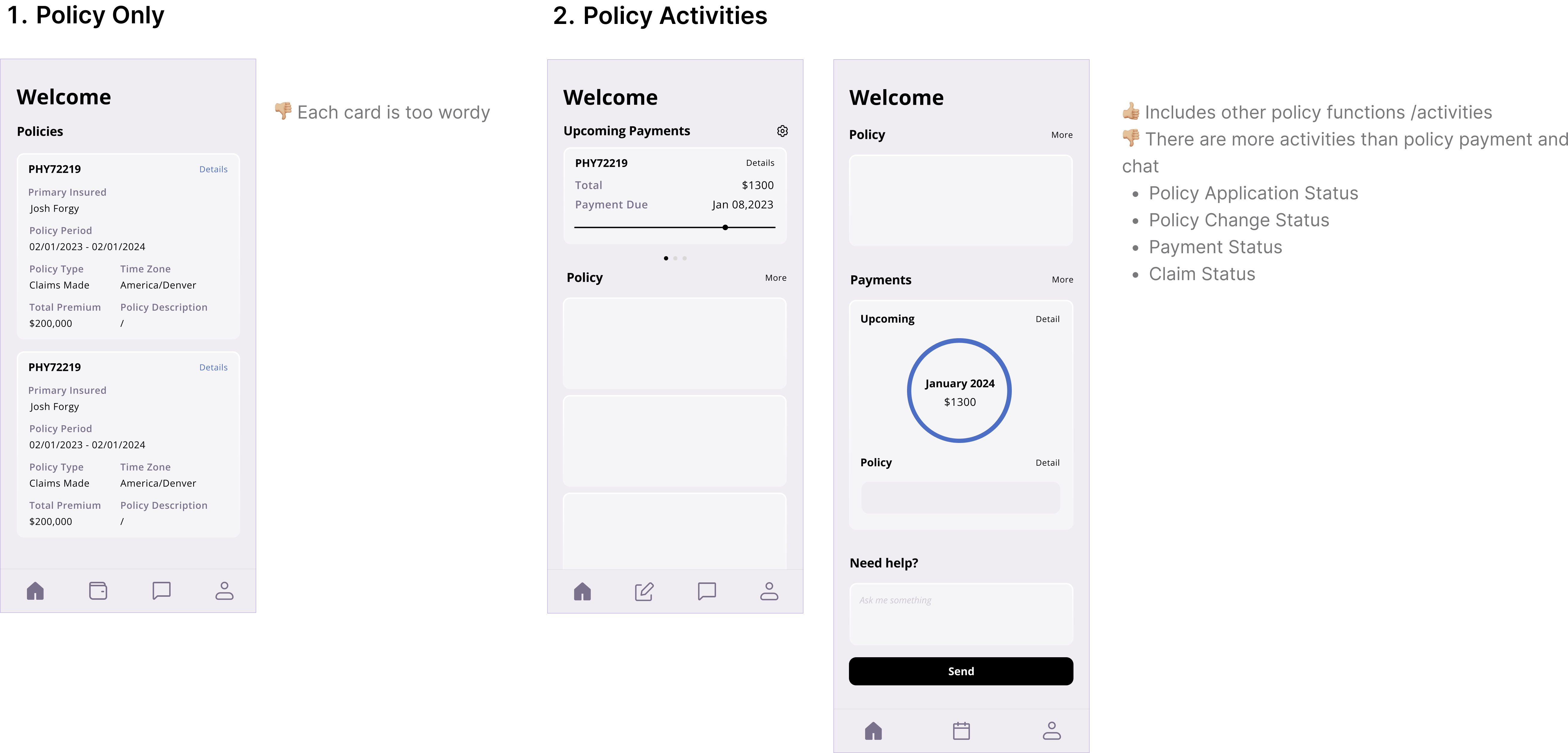
🏠 Home function prioritization

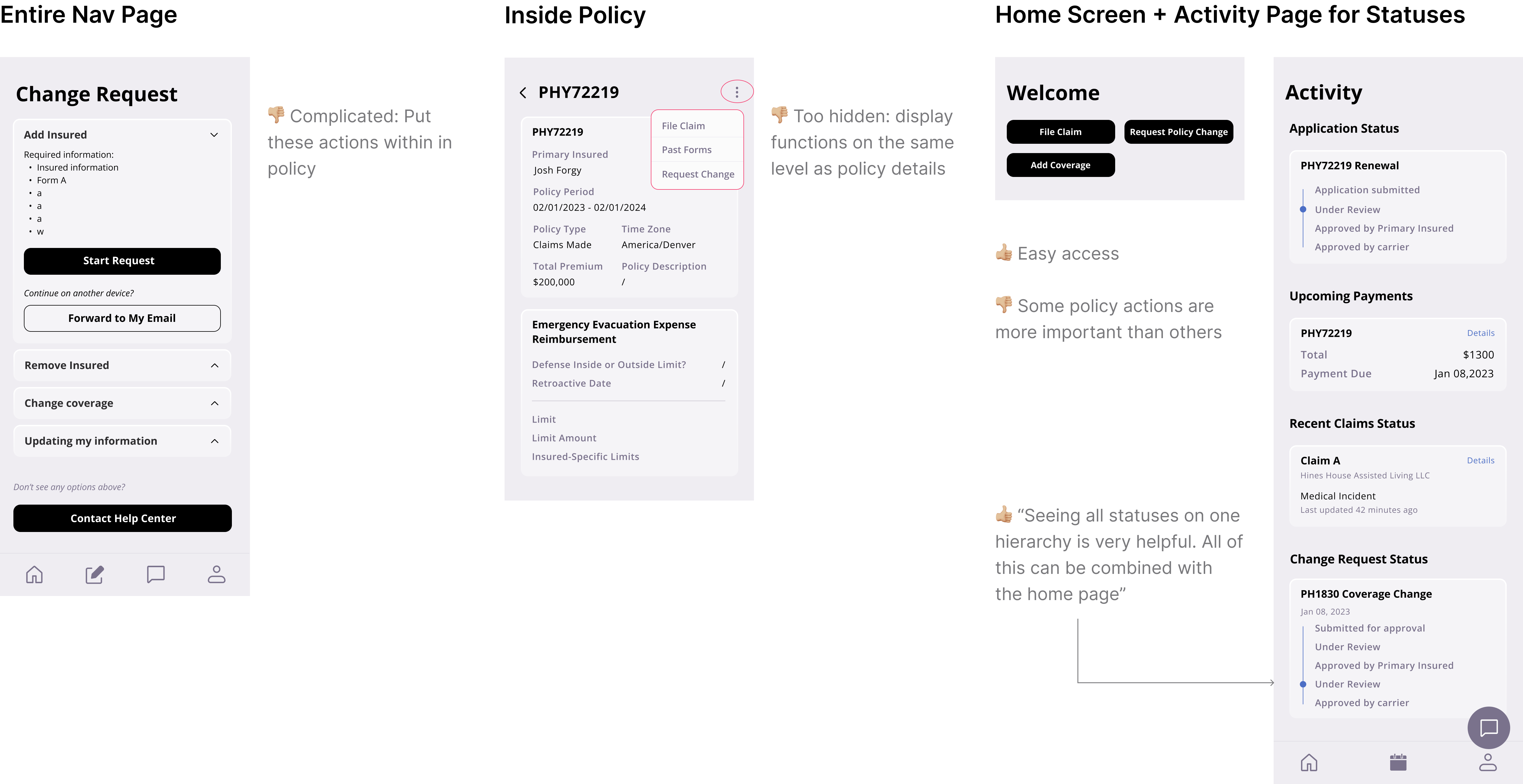
💼 Policy activities
"A large portion of management beyond having access to the policy is making changes and taking additional actions." -stakeholder

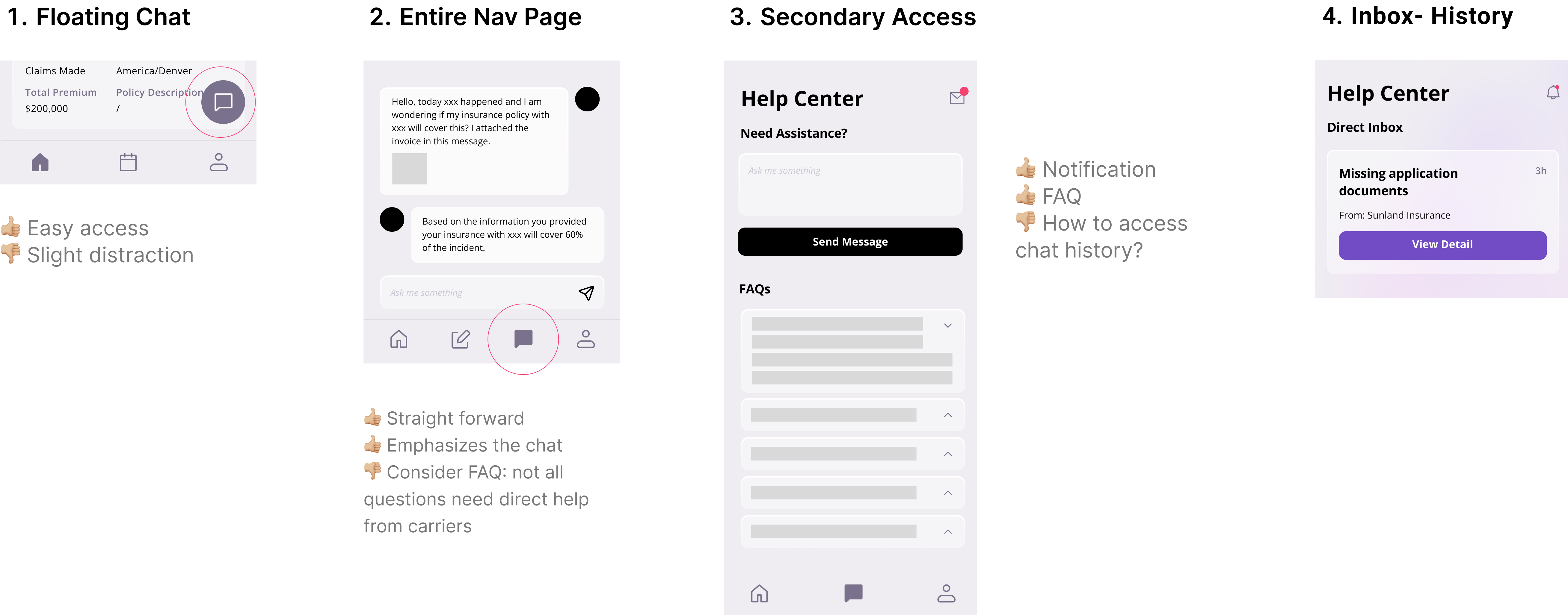
💬 Help center for efficient communication
"It's vital that insureds can communicate directly with their policy carriers" -stakeholder

What do users value?
Efficiency and delegation
"Streamlined experience between me and my insurance carrier makes it easy!" -user

"Usually, I need my broker, but now I can can add insureds myself at no extra cost!" -user

The missing piece: responsive design
"Some tasks are easier done on my computer" -user

Responsive design
Solidifying the design system to unify the experience cross platform.


Design system
Solidifying the design system to unify the experience cross platform.


